
Student Project · E-commerce UX/UI · Visual Design

Tulips & Roses Florist

A desktop e-commerce website concept designed to help customers discover floral arrangements, schedule delivery, and access customer support.

  • Adobe XD
  • E-commerce UX/UI
  • Information Architecture
  • Accessibility
Tulips and Roses florist homepage design
Homepage design

Creating an approachable floral-shopping experience

Tulips & Roses is a desktop e-commerce website concept created in Adobe XD for an online florist. The experience helps customers browse flowers by occasion or color, schedule delivery, and contact customer support.

Support several shopping needs without creating confusion

Flower customers often have a particular occasion, color, delivery date, or recipient in mind. The website needed to make these choices easy to find while preserving the emotional and visual character of the floral products.

Customers also needed clear access to search, account, cart, delivery, and customer-support functions.
A consistent three-page shopping journey

I created connected homepage, product-category, and support-page designs. Repeated navigation, product cards, and footer sections establish a predictable experience across the website.

Soft colors and floral photography support the brand while brighter buttons distinguish important actions.

UX/UI and visual design

I designed the website’s interface and customer journey in Adobe XD. I was responsible for organizing the content, developing the visual direction, and creating the page layouts.

  • Page layout and visual hierarchy
  • Navigation and information architecture
  • Product-card design
  • Shopping and delivery controls
  • Customer-support form design
  • Typography and color selection
  • Accessibility and contrast review
  • Image research, licensing, and attribution

Three connected desktop pages

The page designs support product discovery, delivery planning, and customer service.

01

Homepage

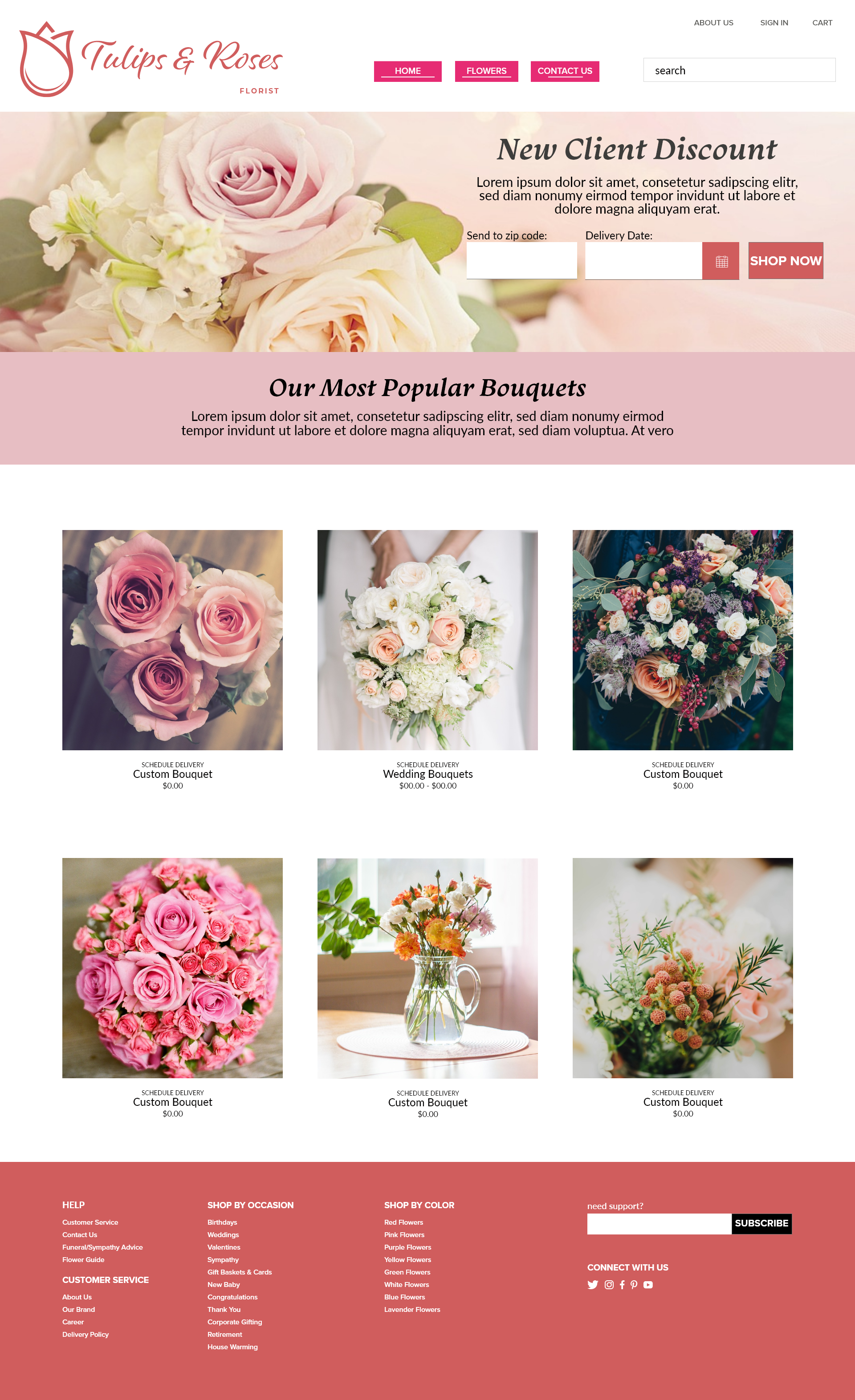
The homepage introduces the florist’s brand, promotes a new-customer discount, requests delivery information, and highlights popular bouquets.

Full Tulips and Roses florist homepage
Select the image to view it at full size.

02

Wedding Bouquets

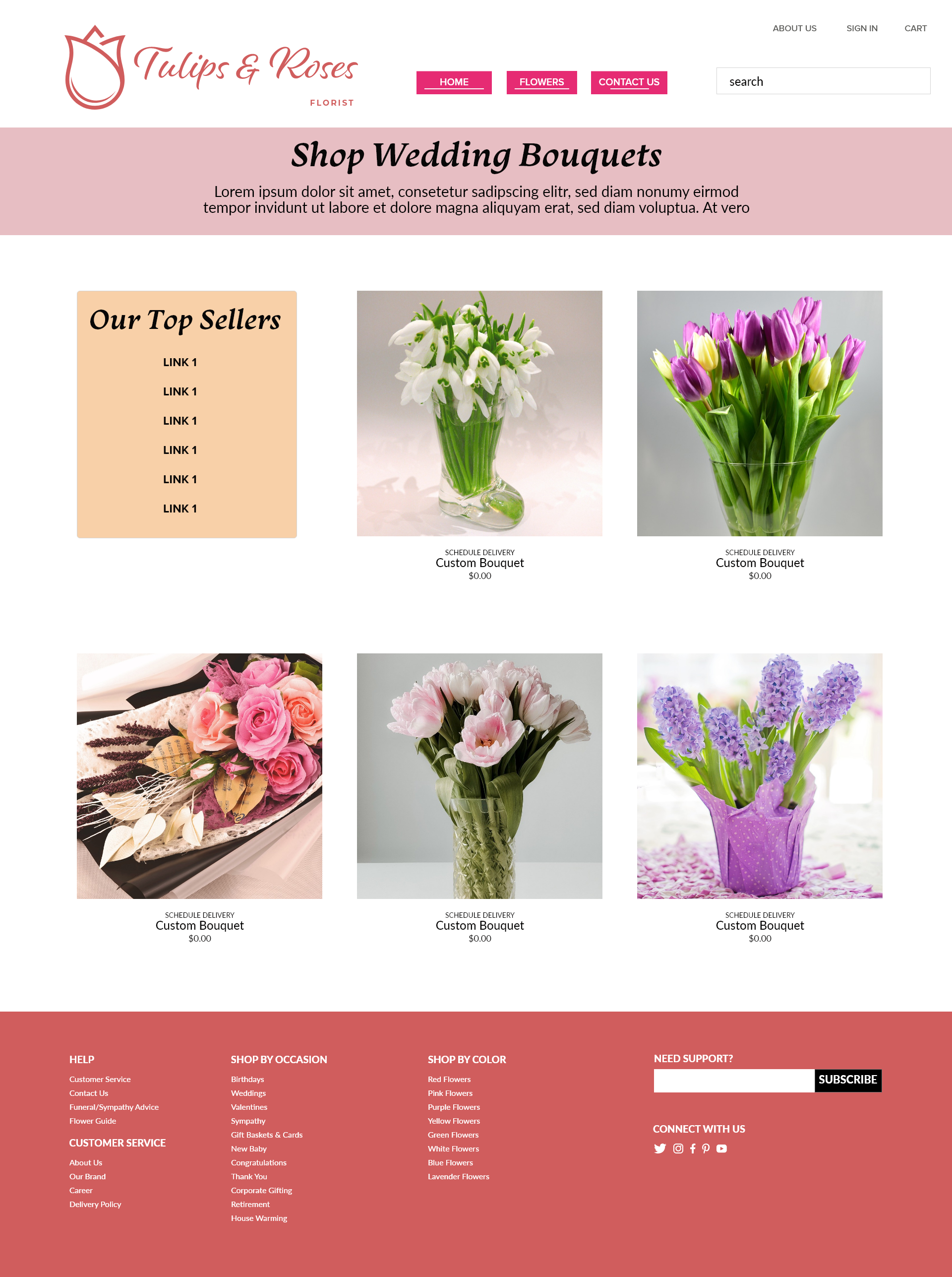
The product-category page helps customers browse wedding arrangements and identify featured products. Repeated cards support visual comparison and scanning.

Tulips and Roses wedding bouquet category page
Select the image to view it at full size.

03

Contact and Support

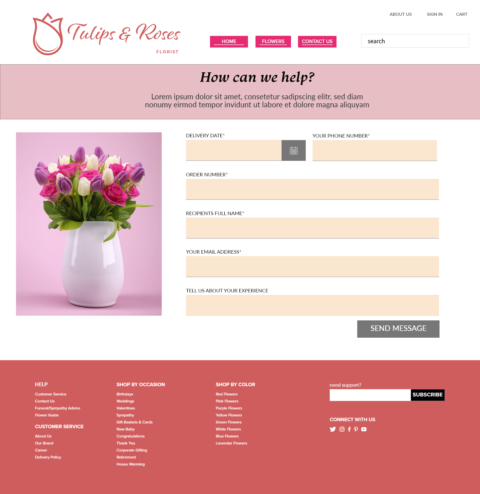
The support page collects delivery dates, phone numbers, order numbers, recipient names, email addresses, and descriptions of customer concerns.

Tulips and Roses customer contact and support page
Select the image to view it at full size.

A predictable path through the website

The primary navigation focuses on Home, Flowers, and Contact Us. Secondary account functions provide access to About Us, Sign In, Cart, and Search.

The footer expands the site structure with links organized by customer service, occasion, and flower color. This gives customers more than one way to locate important information.

Balancing expression with usability

Visual direction

Soft pinks, coral tones, floral photography, expressive display typography, and generous white space create an elegant and approachable presentation.

Product visibility

Consistent product cards and organized grids allow the floral photography to remain the main visual focus while supporting quick comparisons.

Primary actions

Bright navigation and shopping buttons establish contrast and make important actions easier to identify.

Readable and responsibly designed

I used Adobe Color’s color-blind-safe tools to review the palette. Consistent heading, subheading, and body-copy sizes establish a predictable hierarchy.

Clear grids, whitespace, proximity, and familiar form labels help users encounter information in a logical order.

I also researched and documented the creator, source, and license for the project’s flower photographs.

A consistent e-commerce presentation

The completed Adobe XD presentation demonstrates a connected three-page shopping experience that balances brand expression with product discovery, delivery planning, and customer support.

What I would improve next

A future iteration would replace placeholder copy and pricing with realistic product content, add product-detail and checkout screens, and adapt the layouts for mobile devices.

I would also conduct usability testing to determine whether the navigation labels, delivery controls, product categories, and form requirements are sufficiently clear.