Branding · UX/UI · Responsive Web Design

Fernscape Interiors

A complete visual identity and responsive website concept for an interior plant-design company focused on bringing natural, welcoming environments into homes and workplaces.

  • Brand Identity
  • UX/UI
  • Responsive Web
  • Wireframing
  • Visual Design
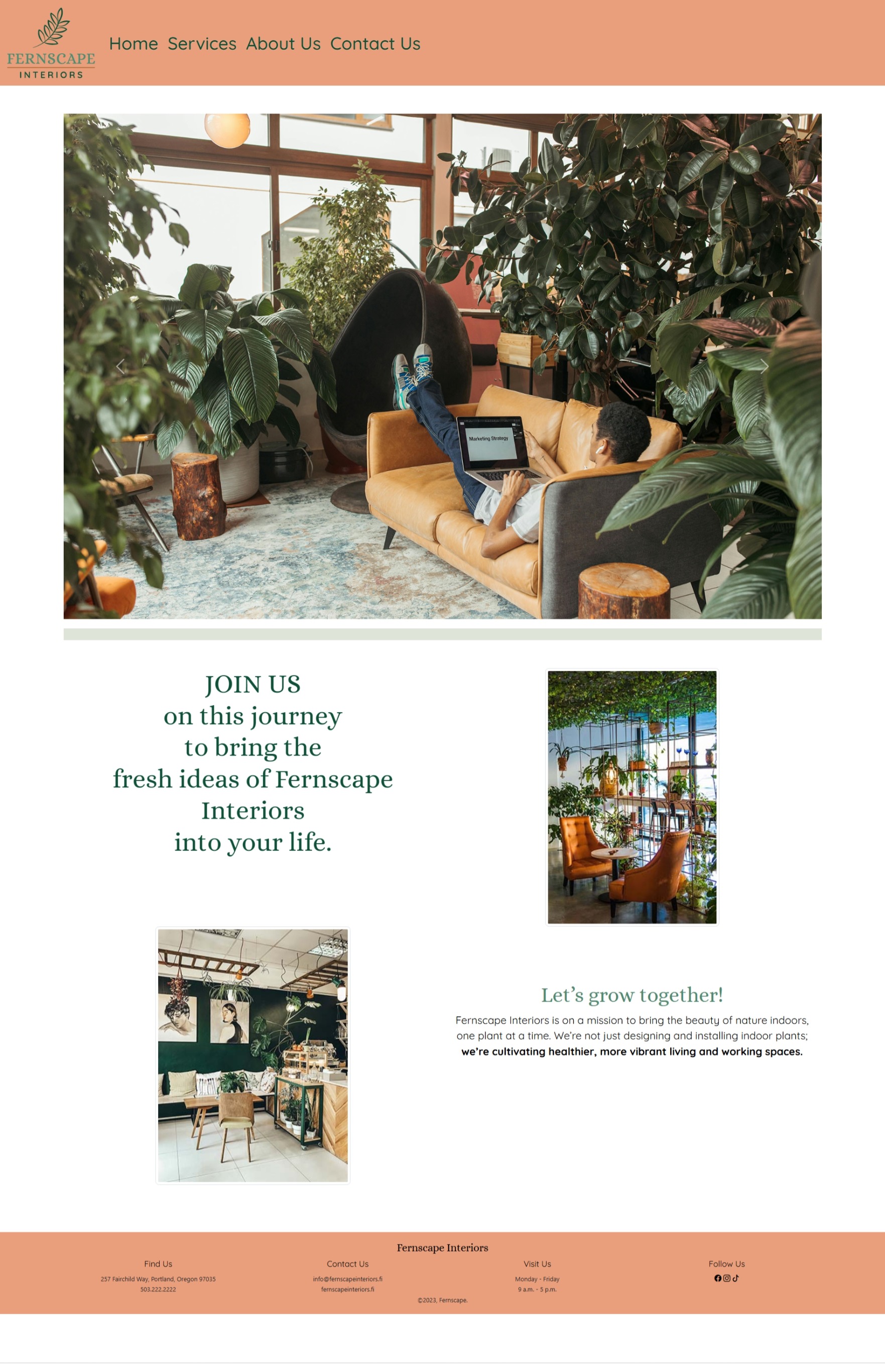
Fernscape Interiors website design

Project overview

Building a brand experience from identity to interface

Fernscape Interiors is a concept for an indoor plant-design and maintenance company serving residential and commercial spaces.

The project involved developing a visual identity, establishing brand standards, planning the website structure, creating responsive wireframes, and applying the completed brand system across the final web pages.

The resulting experience uses natural photography, soft color transitions, plant-inspired greens, and approachable typography to create a calm and welcoming digital presence.
Design goals

Create an experience that feels natural, professional, and easy to explore.

01

Establish trust

Create a polished visual identity appropriate for a company providing design and maintenance services in homes and workplaces.

02

Organize services

Make the company's plant-design, installation, maintenance, office, residential, and workshop offerings easy to understand.

03

Support responsive use

Develop layouts that can transition from desktop to smaller screens without losing hierarchy or readability.

Brand identity

A visual system inspired by greenery and interior spaces

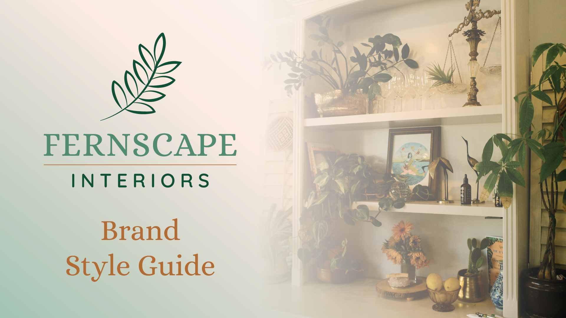
Before designing the website, I developed a brand guide defining the logo, color palette, typography, imagery, tone, and usage standards.

Fernscape Interiors brand style guide cover

Logo system

A botanical mark with flexible applications

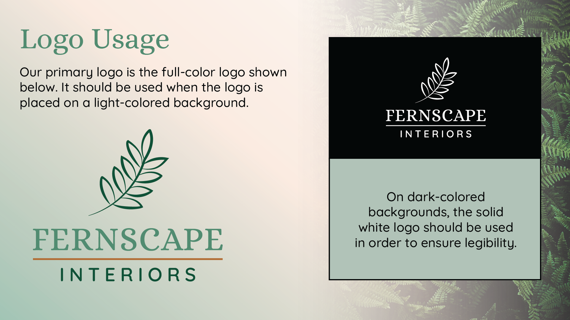
The Fernscape identity uses a simple leaf illustration paired with a serif wordmark and widely spaced “Interiors” lettering.

The brand guide also defines a reversed white version for dark backgrounds so the identity maintains sufficient visual contrast across applications.

Fernscape Interiors logo usage guidelines

Visual system

Natural color and approachable typography

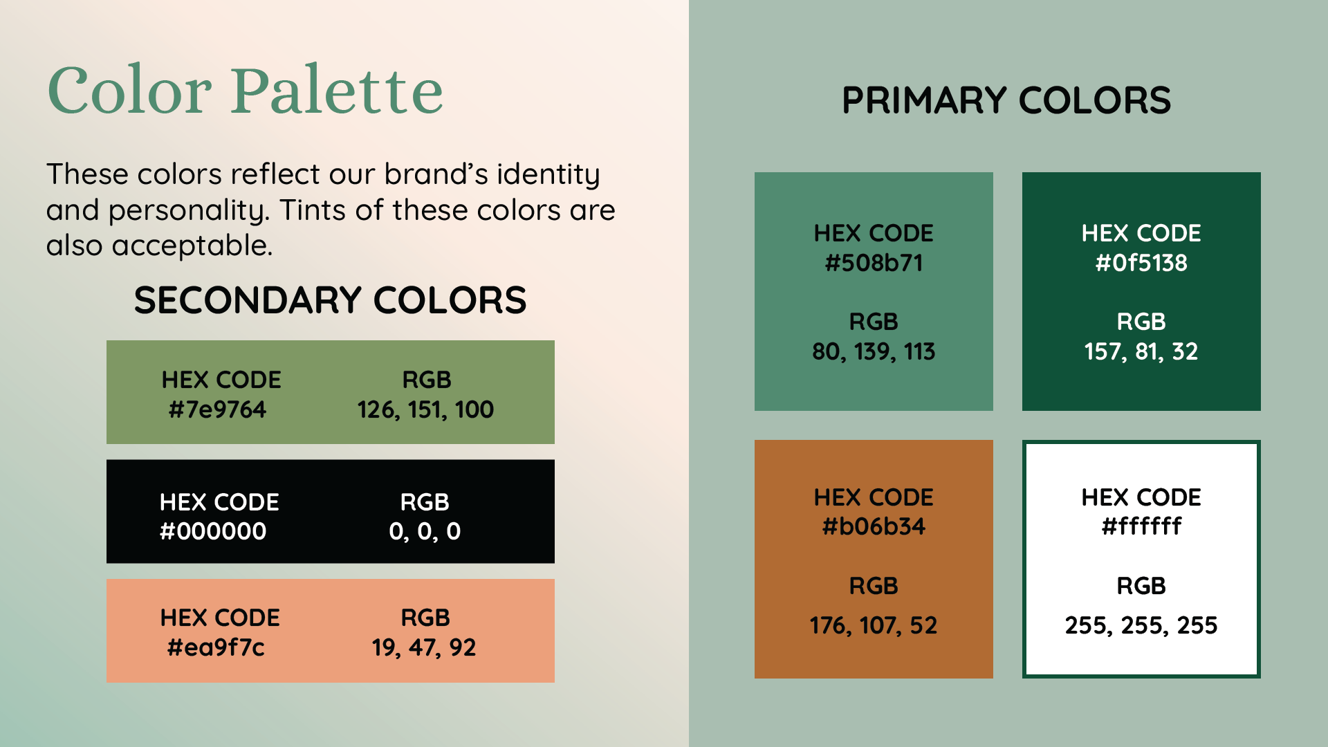
Fernscape Interiors brand color palette
Primary and supporting colors
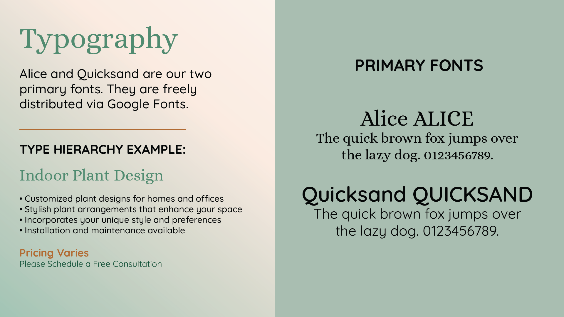
Fernscape Interiors typography guidelines
Alice and Quicksand typography
#508B71 Primary green
#0F5138 Deep green
#B06B34 Warm brown
#ED9F7C Soft peach
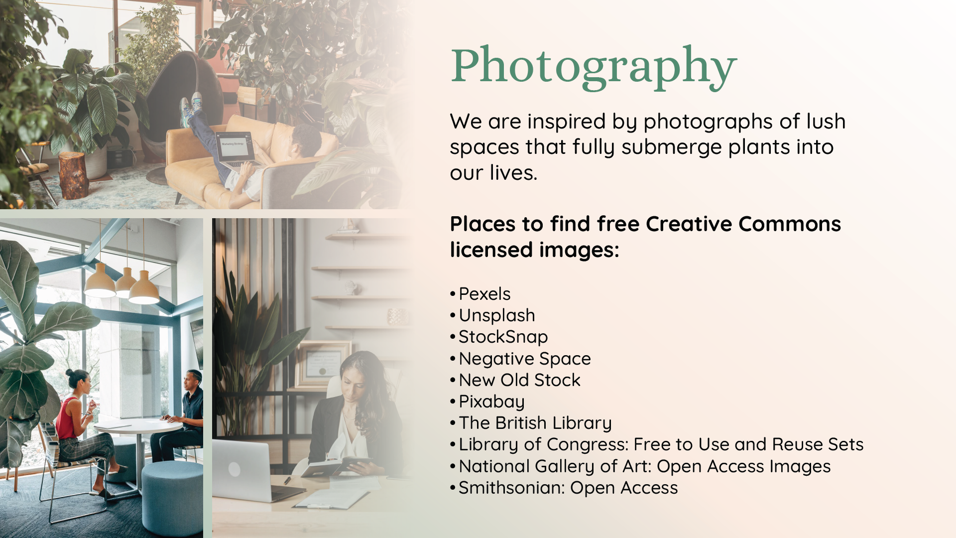
Fernscape Interiors photography guidelines

Photography

Showing plants as part of everyday environments

The imagery focuses on interior spaces where plants are integrated into homes and workplaces rather than presented as isolated products.

This direction supports the central idea of Fernscape: using plant design to create more inviting living and working environments.

UX/UI process

Planning the experience before applying the brand

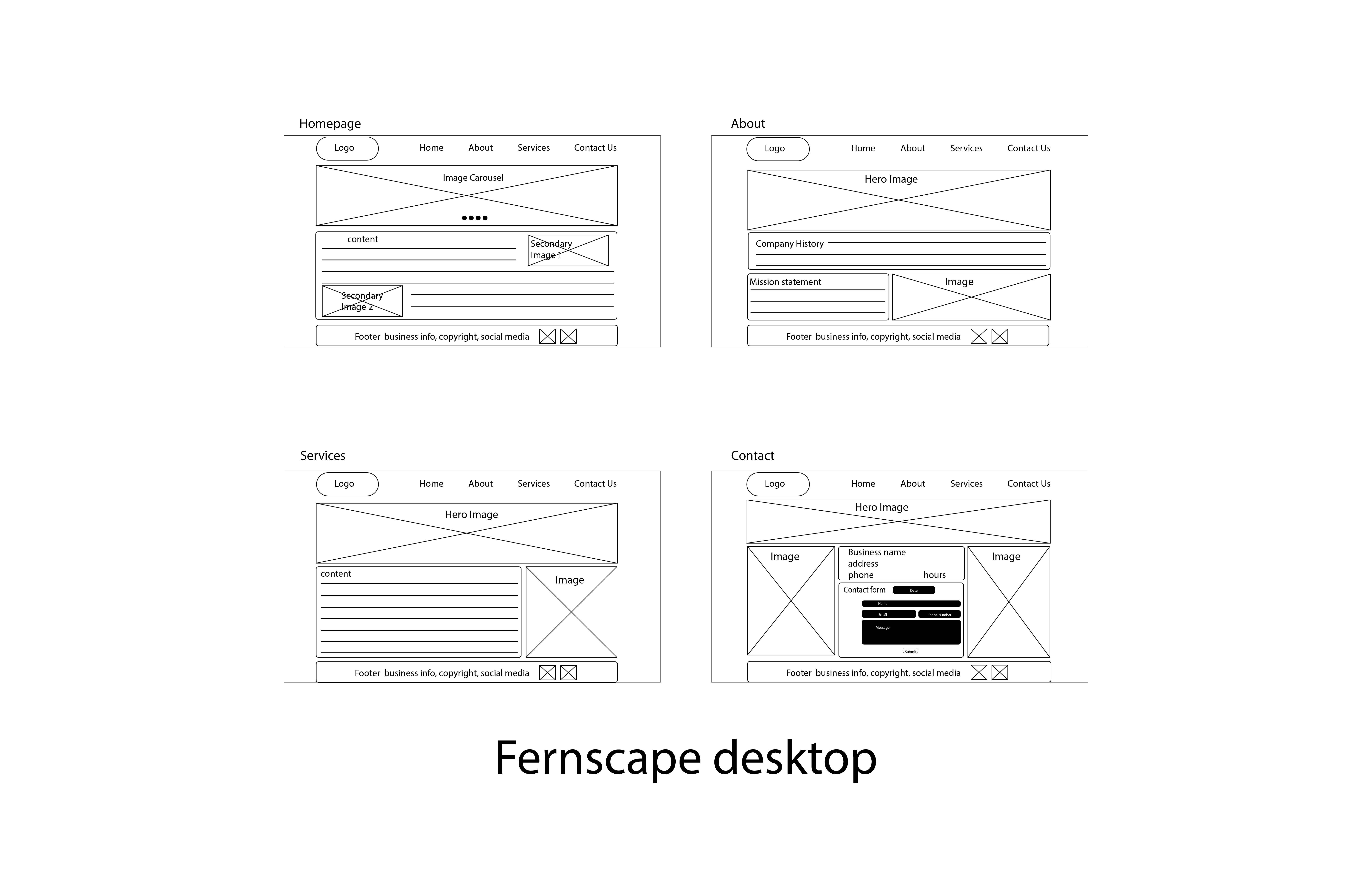
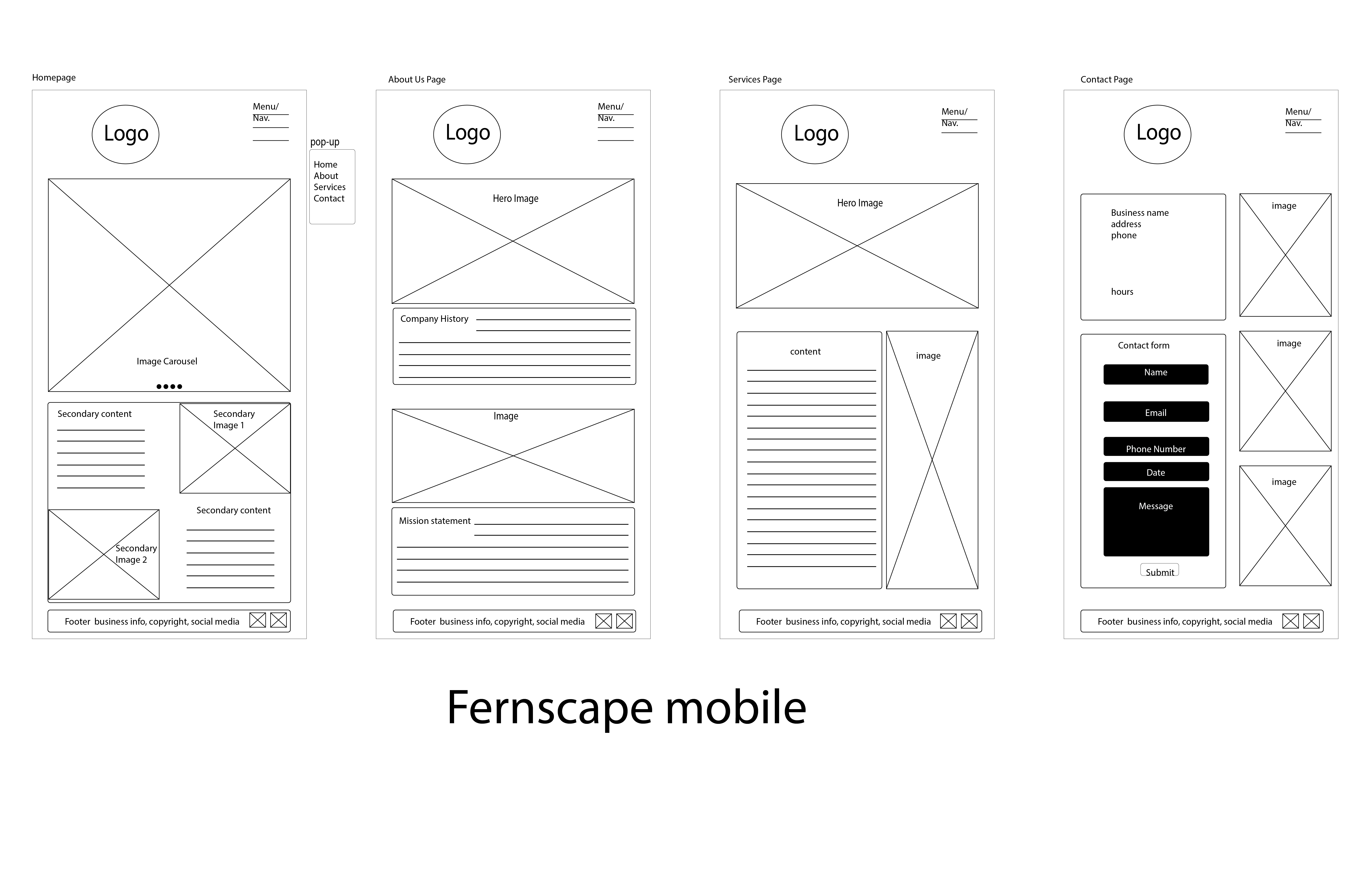
I used wireframes to establish page structure, navigation, content grouping, image placement, and responsive behavior before moving into the final visual design.

Desktop wireframe for the Fernscape Interiors website
Desktop wireframe
Mobile wireframe for the Fernscape Interiors website
Mobile wireframe

Final website

Translating the brand into a complete web experience

The final website applies the Fernscape identity across a consistent navigation system, large environmental photography, service information, company storytelling, and contact content.

Home & services

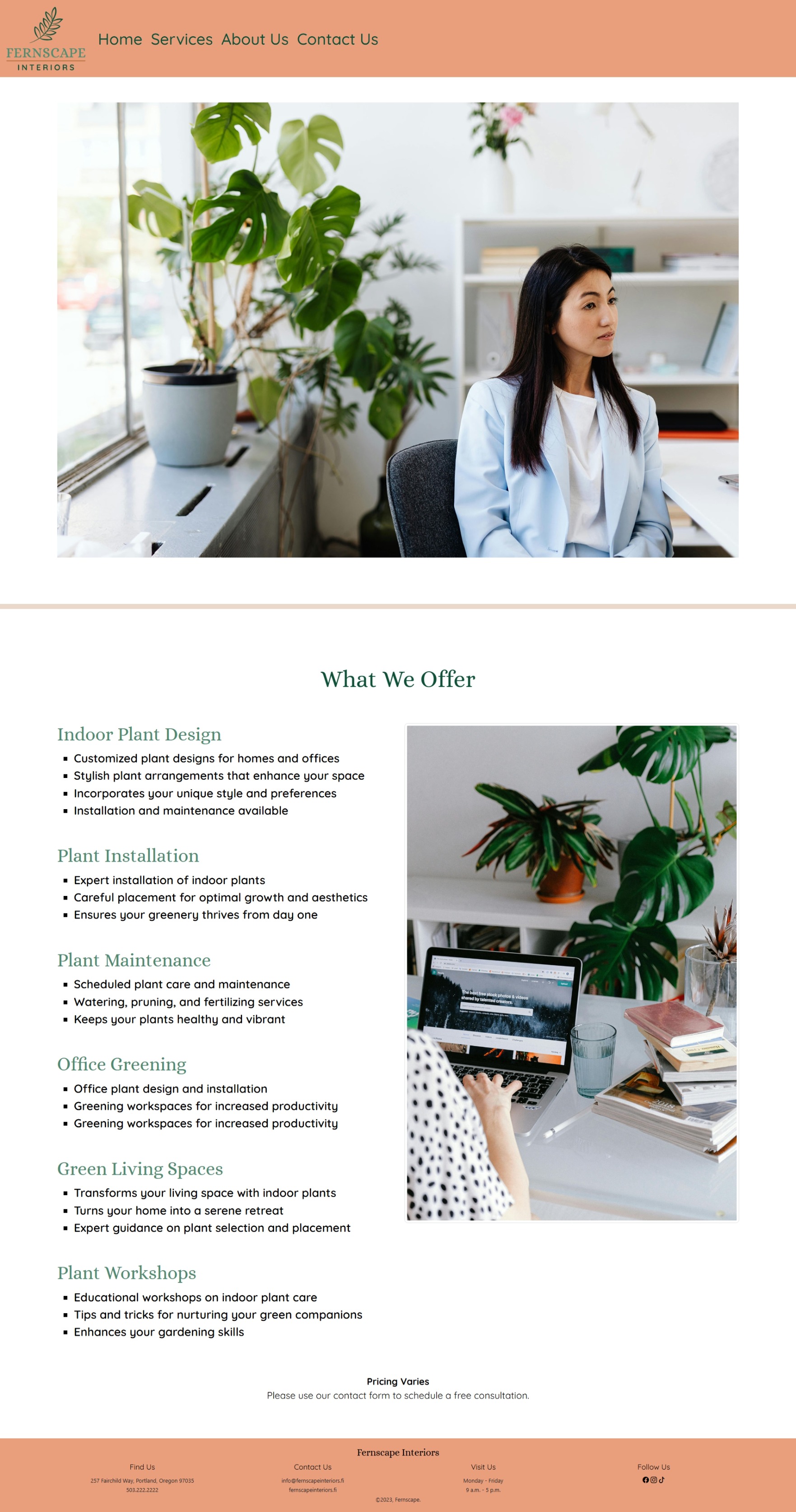
Making the service offering easy to scan

The home experience immediately introduces the Fernscape visual identity and uses a large lifestyle image to establish the atmosphere of the brand.

Service information is organized into clear groups covering indoor plant design, installation, maintenance, office greening, residential spaces, and workshops.

Fernscape Interiors services website page
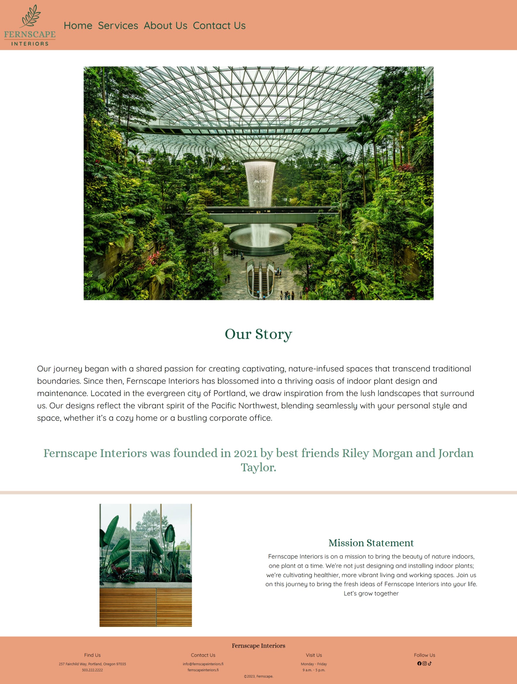
Fernscape Interiors about website page

About page

Supporting the brand with a human story

The About page combines large environmental imagery with the company story and mission to explain the thinking behind the business.

Spacious layouts and restrained typography allow photography to remain a major part of the visual experience.

Contact experience

Keeping next steps clear and approachable

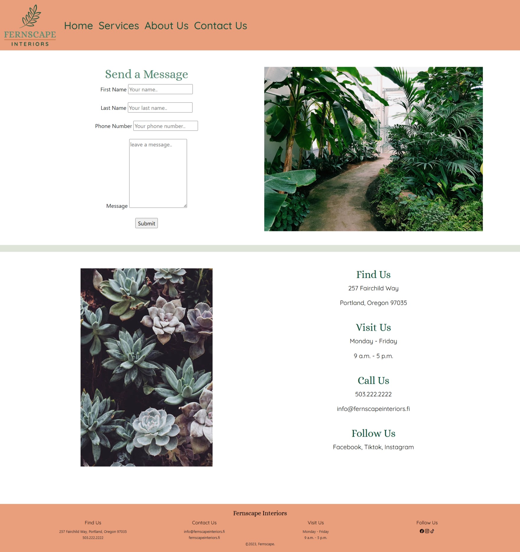
The contact treatment brings together business information and a plant-filled environmental image, maintaining the same visual tone used throughout the rest of the experience.

Contact details and social channels are grouped together so visitors can quickly identify how to reach the company.

Fernscape Interiors contact page design

Outcome

One identity across brand and digital design

Fernscape demonstrates how a visual identity can extend beyond a logo and become a complete digital system.

Consistent typography, color, photography, spacing, navigation, and content hierarchy connect the brand guide and website into one recognizable experience.

What I learned

Designing beyond individual screens

  • Establish brand rules before applying visual design
  • Translate identity decisions into interface patterns
  • Use wireframes to solve structure before styling
  • Design content hierarchy for multiple page types
  • Maintain visual consistency across a website
  • Consider responsive behavior early in the process

Explore another project

See how the same design thinking adapts to a multi-channel campaign.

View Get LIT